
Brand Journal · DERMAPAW JOURNAL
Less, by design.
A quiet palette, functional packaging and room for the details that matter.
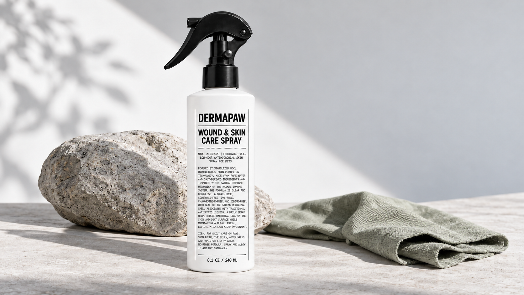
DERMAPAW takes its visual cues from contemporary skincare: a soft white base, near-black typography, pale-gray backgrounds and natural directional light.
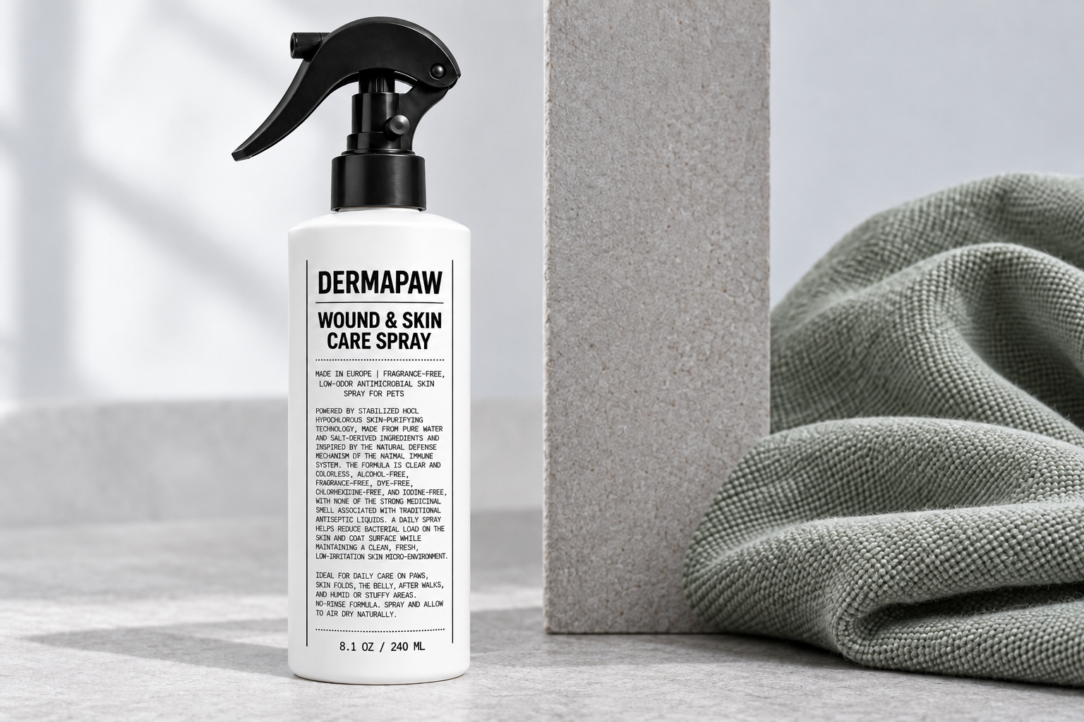
The packaging combines a bold brand name with compact technical typography. Thin dividers create order without adding decoration. On the website, generous spacing and clear navigation carry that same approach from bottle to screen.
The main navigation stays focused on four destinations: Home, Product, Article and About Us. Product pages explain the spray, while editorial pages explore everyday pet care.
The purpose is to keep the brand language clear, calm and useful.